
Analyse roadkills
Where are animals reported?
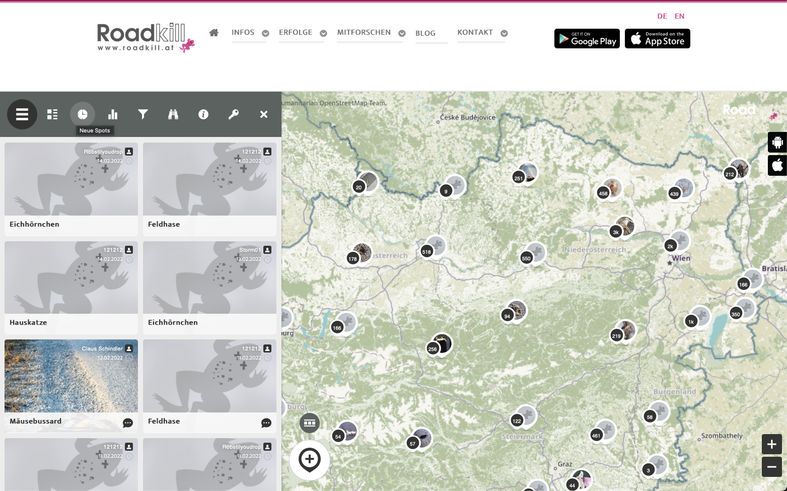
When you open our project website or the apps, the map with the many spots jumps out at you. The map is automatically set to a certain area. On the website, for example, you can see a section of Europe, and in the app you can zoom in to the respective location. Whether on the website or in the apps, the map can be zoomed in and out as desired to get either a worldwide overview of where animals are reported, or you can search for a single municipality or a specific street to see which animals have been reported there. The zoom function can be controlled on a computer using the mouse, the trackpad or the buttons at the bottom right of the map. On a smartphone, you zoom in and out by placing two fingers on the map and dragging them apart or together.
As you move through the map, you can see the spots loading. If you zoom out of the map, individual spots stack up to maintain an overview. If you zoom into the map, the stacks split up again. Clicking on a stack also enlarges the map and splits the stack. The following screen record shows what this looks like.
When are animals reported?
There are three very helpful tools to answer this question.
- View the most recent spots.
- The timeline.
- The heatmap.
View the most recent spots
Let's first look at the latest spots. This tool can be found in the grey menu bar by clicking on the " Watch" symbol. Here you can immediately see which animals were last reported by which citizen scientists. Clicking on a spot immediately moves the map to the right to the location where the spot was found, and there you can select the spot, you can comment, share and like it.
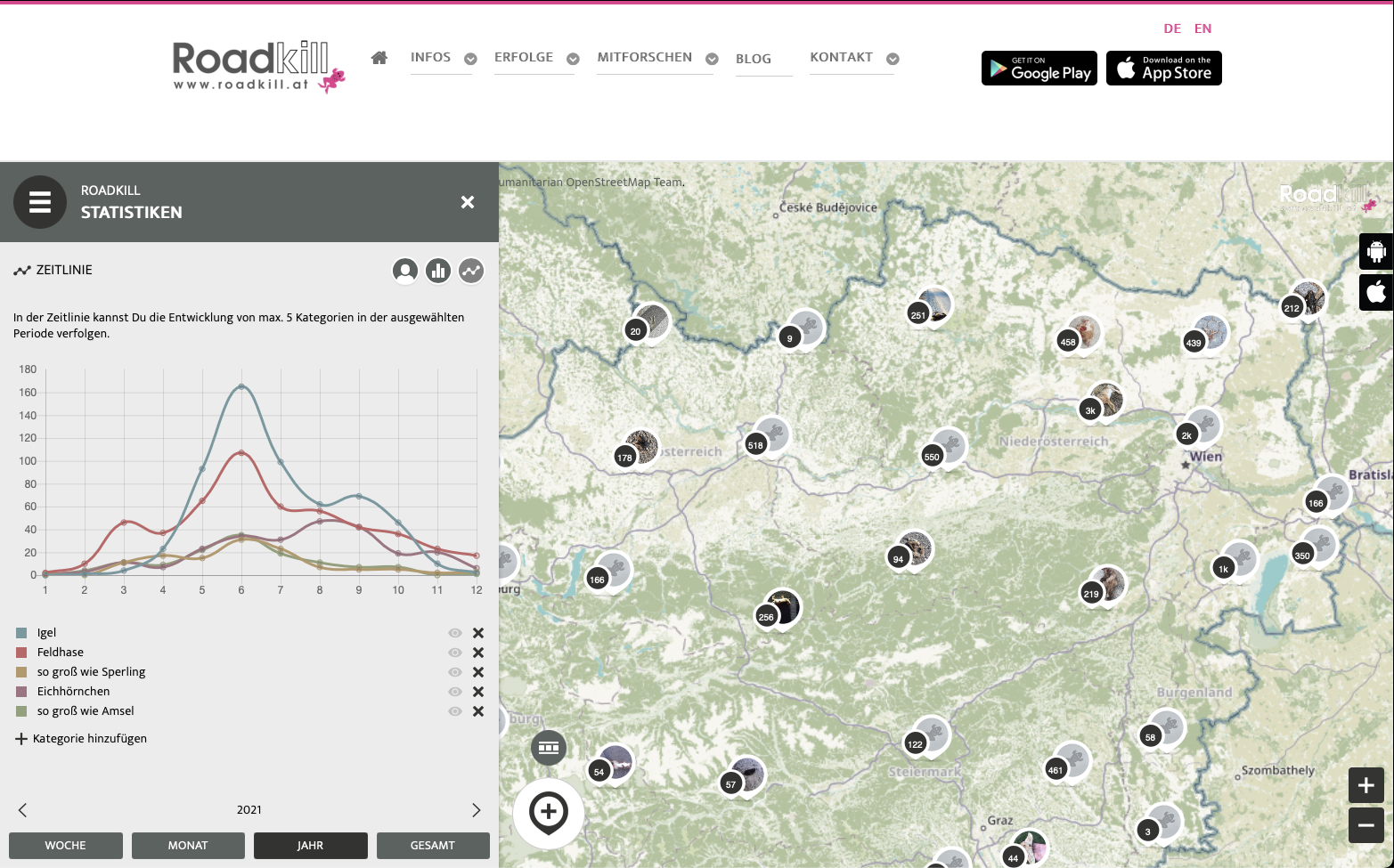
The timeline
The timeline is also located in the grey menu bar, but right next to the icon with the latest spots, under the icon that looks like a bar chart. Here you will find all the statistics that we will describe below.
If you now click on the symbol with the bar chart, a new menu appears on the right in the white area, which consists of three circles. We first look at the rightmost circle with the line. This is where the timeline is hidden. In this area we see a line diagram with several coloured lines, each line reflecting an animal group. The diagram is structured in such a way that the x-axis (the lower bar) shows the course of time and the y-axis (the side bar) shows the number of animals reported. Here you can also set which groups of animals you want to see and which time periods you want to see. In the screen record below we show you exactly how to do this. In the yearly setting, you can see how the number of reports increases in spring and decreases again in late autumn.
The heat map
The heat map can be found in the online map and in the app via the small grey symbol with the three squares and two bars in the map. In the screenshot above you can see it directly above the "Add Spot" symbol. If you click on it, the map changes and you can see by colour where the most animals have been reported (red), where less (orange/yellow) and where none at all (in grey). In the following video we show how to use this heat map.
The heatmap feature was developed with the support of the Austrian Science Fund (FWF) [PUD 19-B].
![]()
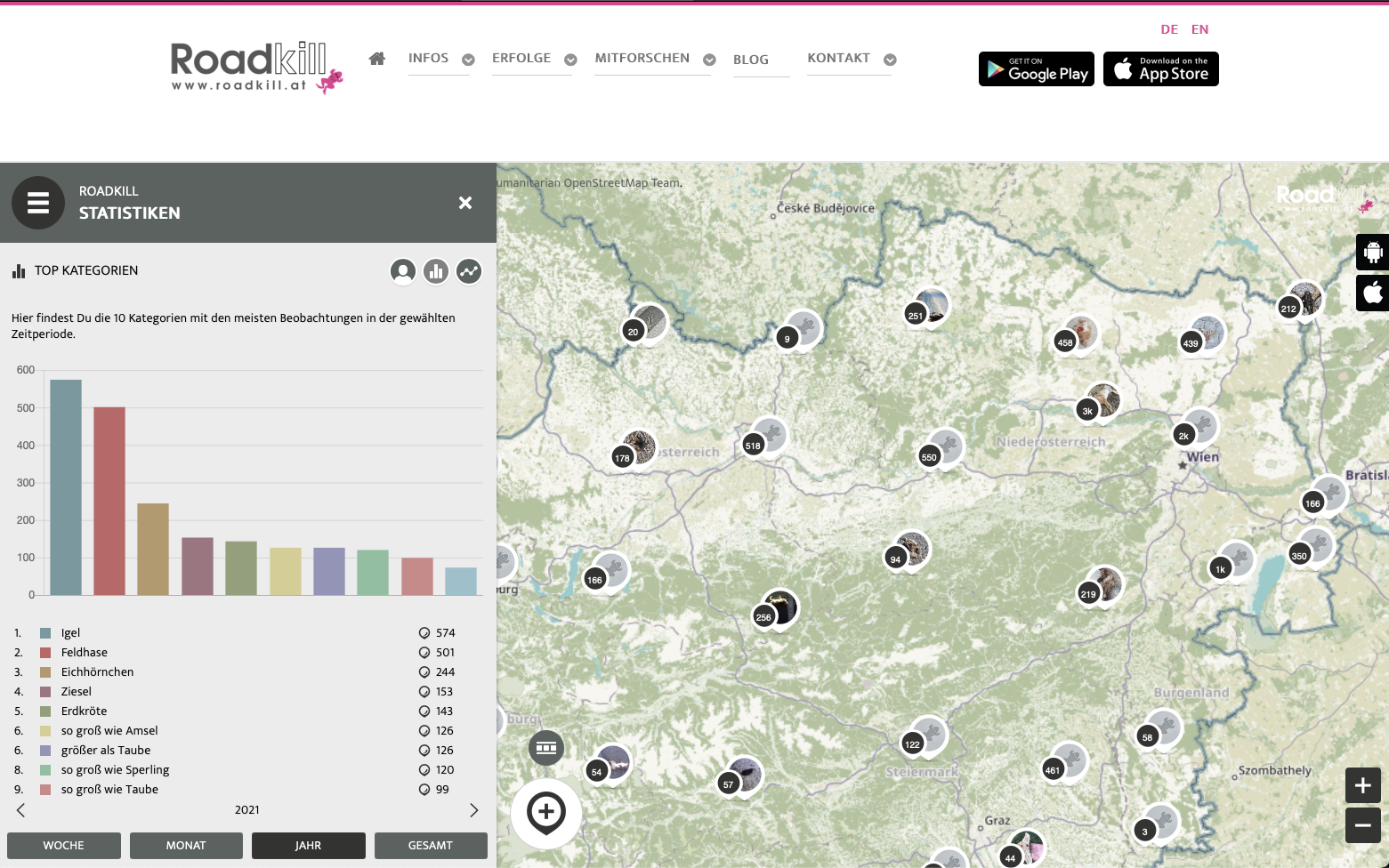
How many animals are reported?
The quickest overview of how many animals are reported can be found in the second submenu of the statistics under the menu circle with the bar chart in the middle. Here you can see the ten most frequently reported animal groups per period selected below.
In addition, you can of course also see in the map itself how many animals were reported in which space. The total number is displayed automatically. If you want to see a selected animal group, you can use the filter, which can be found in the main menu under the "funnel" symbol. If you select an animal group here, the spots on the map are filtered according to it.
Screen recordings:
What interests you most?
We would like to encourage you to use the statistics and "play with the numbers". Feel free to write us your observations, thoughts and research questions via "Ask a research question". We look forward to it!